
What makes a website great? Part Four – Final Installment
John R Ramos • March 17, 2020
Use clear navigation

Providing your visitors with a clear way to navigate your site is very important, especially as your business grows and you start to offer a large range of products and services. If you’ve thought carefully about your strategy and cut out unnecessary material from your site, the navigation bar should be obvious.
Your navigation bar should present the different sections of your site, and be arranged hierarchically so that customers can easily find what they are looking for and get to it in one click.
“Below The Fold”

Ten years ago, the perceived wisdom was that homepages – the first page a visitor looks at on your site – should be as short as possible. The thinking was that the homepage should essentially be an extension of your navigation bar, presenting customers with a range of options as to which page to visit next.
That advice is now obsolete. A recent survey of more than 230 B2C-focused websites by SurveyCool found that “roughly 82% of the surveyed businesses used one or more above-the-fold CTA.” Increasingly, the best sites are using their homepage more like the front page of a newspaper: to highlight their unique offering before customers explore the site further. The content you can put on your homepage can include:
- Value proposition
- Intro Video
- Overview of Services
- Product Features
- About Us
- Testimonials
- Case Studies/Success Stories
- Resources
Aim to include at least three of these items on your homepage, because this page offers you a free space to tell your customers what you think is most important about your company. Don’t be afraid, either, to have this page scroll – as long as the material is engaging enough, your customers won’t resent this.
Be mobile-first

Mobile optimization is now a must-have for every site owner. 80% of internet users own a smartphone, and large websites are seeing mobile traffic increase exponentially.
Optimizing your site for mobile can be a great learning experience as well. Because you have less space to fit your content into, designing for a mobile phone screen can help you think about what is important. As such, implementing this tip helps you to work toward some of the other principles on the list, like strategizing and cutting out unnecessary content.
You should also be aware, however, that encouraging mobile traffic should be done responsibly because it can undermine the security of your website. The number of cyberattacks launched from mobile devices has increased rapidly over recent years, and as your site expands you need to assess every new feature for its potential security implications. That includes mobile-friendly interfaces.
Check that your website loads fast and resolves properly on mobile using a mobile testing tool such as Screenfly or Google’s Mobile-Friendly Test.
Security

An often-overlooked part of building a great website is to make sure that your site is secure. This is particularly important when you are upgrading your site because making major changes can open up major security flaws.
There are a few key ways you can do that. You should be aware of the dangers of running unused plugins on your site and deactivate any plugins that you are not using. You should also make sure that you are using strong passwords for all parts of your site, and preferably using a password manager to generate and manage long, complex passwords for everything you do online.
If your site is used and updated by several different staff members, you should also take steps to ensure that they are not compromising its security. Use firewall protection and a virtual private network (VPN) to encrypt your internet connection. The best VPNs make it almost impossible for hackers to intercept your passwords and other sensitive information. This is particularly important if you work remotely because managing your website off-site introduce vulnerabilities into your workflow.
Testing, testing, testing

Never stop testing your site. A subscription to a web analytics tool is a worthwhile investment because it allows you to see in detail how your visitors are using your site. Tracking your customers’ “journey” through the buying process allows you to adapt your site’s design to improve conversion rates.
Sometimes these changes can be as simple as updating out-of-date landing pages to highlight new products. In other cases, testing your site allows you to see that your navigational structure needs to be improved.
The ultimate test of how “good” your website is the way that your customers use it. You might think it looks great, but unless it is generating traffic, engagement, and sales, it is worthless.
Be original
As I try to finish this article, I need to mention something slightly more complex, yet key elements of a good website. The first is that you should be original.
It can be tempting, after looking at the sites that are performing well in your sector, to merely copy their content. That is a very bad idea. Not only can customers spot the plagiarism, but they are unlikely to come back to your site: after all, they can get the information they need somewhere else.
Make sure that every piece of content you produce is original. Do as much research as you can and offer your customers something more than your competitors can.
Be yourself
Alongside being original, you should also use your website to highlight your personality. A powerful way of connecting with your customers is to draw on your company culture, creating truly unique pages.
Customers are increasingly drawn to companies that they can relate to as friends. That’s why many companies are hiring an influencer marketing agency. But you can also foreground your personality in other, simpler ways. Try injecting a little humor into your landing pages, for instance, or commission a designer to make you some stylish, unique graphics.
You aim to differentiate your company from your competitors. If you can make your customers feel that they are valued and that they are speaking to a real person as this goes a long way toward ensuring their loyalty.
And Finally

If you want to get involved in the designing of your website, you may want to create something with pen and paper as you discuss your needs with your web developer. You may think this is quite outdated but in the long run, it may turn out quite profound.
At the end of the day, the key to designing (or improving) a website is simplicity. The less you put on your site, the quicker your customers can find what they need. Your site is also going to be faster, more manageable, and more secure.
So, the bottom line is keeping your site design as simple as possible, while still providing your customers with everything they need, and you’ll be well on your way to a killer website.
I hope that if you have found these articles of value, that you would share them in your social media platforms. You are certainly welcomed to reach out to us if you want to have a free ½ hour consultation.
POST WRITTEN BY
John R. Ramos
The JR Solutions Blog

A few years ago, I spent money on software that promised to help me write better marketing copies. I wanted to develop my copywriting skills professionally. The offer sounded practical: use this software to organize my thoughts and put together a more effective message. I bought it. I followed the instructions. I gave it a try. The content attracted little readership, and I didn’t see enough value to justify what I had spent. Looking at the finished work, I felt I could have written something comparable myself. Then the next offer arrived. This version would help me create more targeted messages, with better hooks and more persuasive words. A few days later, another offer followed. The upgrades were optional. But each message gave me another reason to question whether what I had already purchased was enough.
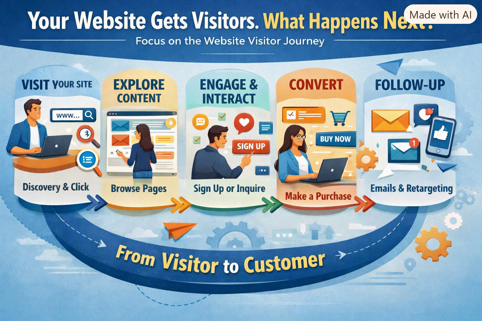
When I visit a prospect’s website, I’m trying to understand the business before we talk. What do they offer? Who do they serve? What would make someone choose them? Sometimes, the website leaves me with more questions than answers. I can find the business name and a few general statements, but I have to hunt for the information that would help me take the next step. As a business owner, you already know your services. You understand your process. You know what makes your work worth paying for. Someone visiting for the first time needs help seeing those things. Look at your website through a customer’s eyes Let’s use a hypothetical neighborhood gym. A person living nearby wants to start exercising again. They haven’t belonged to a gym in years, and they’re a little uncomfortable about walking into one. They find the gym’s website. There are photos of equipment and people lifting heavy weights. The headline says, “Reach Your Full Potential.” That sounds encouraging, but they still have questions. Are beginners welcome? Does someone explain how to use the equipment? Are there classes that fit around a work schedule? Can they visit before joining? If the website leaves those questions unanswered, making contact becomes another task they might put off. Give people something they can use For our hypothetical gym, a current class schedule would help. So would an introduction to the trainers and a short explanation of what happens during a first visit. Photos of the actual facility could help someone picture themselves there. Clear information about membership options could help them decide whether to inquire. Think about the questions people ask when they call your business. Those conversations can tell you what belongs on your website. You don’t have to answer everything. Give visitors enough information to feel comfortable continuing the conversation. Make the next step clear Suppose the gym’s main invitation is “Subscribe to our newsletter.” You know I believe in newsletters. Email marketing has been a large part of my work for 14 years. But someone considering a gym membership may first want to see the facility or speak with a trainer. “Schedule a tour” gives that person a useful next step. Explain what happens, too. How long does the tour take? Will someone answer questions about membership? Does the visitor need to bring anything? A clear invitation becomes more helpful when people know what to expect. Give interested visitors a reason to stay connected Some people will visit the gym’s website before they’re ready to join. Perhaps they’re comparing options or waiting for their schedule to settle down. Email can help maintain that connection, with their permission. Instead of simply asking them to subscribe, explain what they’ll receive. For this gym, that could mean beginner workout advice, class updates, and introductions to the trainers. Then deliver what you promised. Useful, consistent emails give people opportunities to get to know the business before making a decision. Decide what deserves attention first You may be reading this and wondering whether your website needs a complete redesign. That takes a closer look. An older design or a single-page format alone doesn’t tell us enough. Start with the information and actions your customers need. Check whether those are easy to find and use, especially on a phone. If your budget is limited, ask for a proposal that explains priorities. What can be improved within the existing site? What requires more work? What is each change intended to accomplish? You should understand what you’re paying for. Try this today: open your website and imagine you’re considering your business for the first time. Find a service. Look for answers to a few basic questions. Try to make an inquiry. Where do you hesitate? That’s a useful place to begin. At The JR Solutions, I’m preparing to add website development through a collaboration with another agency, alongside my content writing and email marketing services. If your website no longer reflects the business, you run today, let’s talk about what needs attention. Contact me at john@thejrsolutions.com
Part 3 of 3: how three articles about my own business became one lesson. Part 1 was about a process I thought I knew by heart. Part 2 was about a process I forgot I ever built. This one is different. This one is about the process behind this very series: how I decide what to write about each week. The honest answer is that there isn't one method. Some weeks I plan ahead. I pick a topic on Monday and have it written by Wednesday. Other weeks the topic finds me. Something breaks, something surprises me, or something forces me to look closely at my own business, and that becomes the article. A few of these pieces came from weeks that were harder than they looked from the outside. Part 2 came out of a stretch where client work had slowed and I needed a reason to sit down and actually examine my own systems instead of avoiding them. Writing about a missing automation was easier than saying out loud that business had gotten quiet. Putting it on the page made it real, and making it real made it easier to face.

A 14-year email marketing consultant admits he doesn't have an automation sequence running — and explains why that's the right call for now. Part 2 of 3.
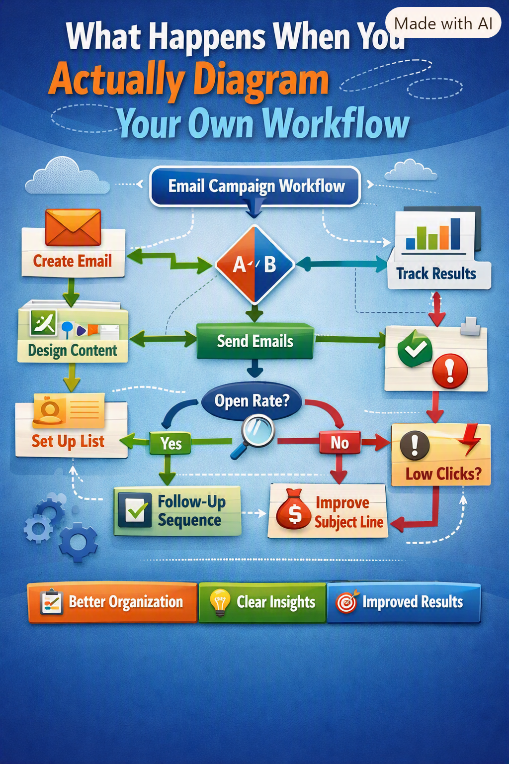
A 14-year email marketing consultant flowcharted his own campaign-building process — and found a real gap in it. Part 1 of a 3-part series.

A 14-year email marketing consultant ran a real 30-day test letting AI write client emails. Here's what worked, what broke, and what to actually do.
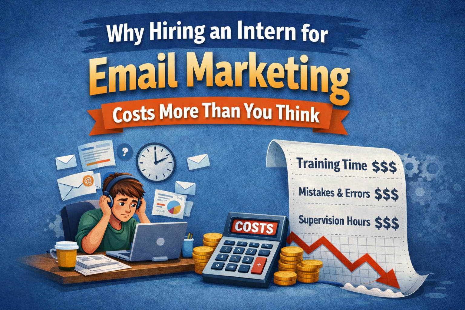
Thinking about hiring an intern to handle your email marketing? Here's the hidden cost most small business owners don't see until it's too late — from a 14-year Constant Contact partner.

Thinking about hiring an intern to handle your email marketing? Here's the hidden cost most small business owners don't see until it's too late — from a 14-year Constant Contact partner.

Gmail and Outlook quietly changed the rules in late 2025. Here's why your small business marketing emails may not be arriving — and what to do.

You are sitting at your desk, looking at the monthly numbers, and the thought crosses your mind: maybe email marketing would help the business. Then you look at the budget again and shake your head. “I can't afford it right now.” I have heard those exact words from more small business owners than I can count. And after nearly 14 years working with small businesses across Orlando and Central Florida, I want to share something that might change how you think about that sentence. Almost every time someone tells me they can't afford email marketing, money is not the real reason. That is not a sales line. It is something I have watched play out over and over. The math, when you look at it honestly, almost always says they can afford it. What is actually going on underneath the surface is usually something completely different. And until we name that, the conversation about email marketing for small businesses never goes anywhere useful. So let us look at it together honestly.