What makes a website great? Part Two
John R Ramos • February 21, 2020
Use Calls to Action (CTAs) correctly
Most people are aware of the importance of “Calls to Action”, or CTAs. The problem is that too many of these simply don’t work. That’s because a boring button that says “click here!” is not going to generate user interaction by itself.
There are two key things to bear in mind when thinking about your CTAs. The first is that they need to highlight the value of what you are offering. Instead of just saying “click here”, encourage your website visitors to “sign up for the latest news”, or “click here to get 10% off”.
So, if you want more email subscribers or contest entries or conversions than I highly suggest you get a bit more creative with the CTAs.
No matter what you’d like to accomplish with advertising and marketing, you won’t do it without the right CTA.
Almost all of your campaigns and content should have well-crafted call to actions designed to drive action.
The second principle that I would like to share with you, is that instead of inline hyperlinks, use buttons, and make sure they look good. Studies show that there can be an increase of clicks by testing different color variations with your action messaging. You can also play around with your design, and see what works for your business.
Hyperlink highlighting
Another trick (if you want to call it that) is to hyperlink highlighting. This is also an important tactic you can use. With so many options when working with text in modern website builders, some people try to reinvent the wheel: making their hyperlinks a strange color.
Showing your hyperlinks must be as simple as possible. Regular websites users will use the color blue with the text underlined, this is pretty standard. At the end of the day, you want your screen readers to see your links, and click on them with minimal load time, this way no one is going to miss them.
Segment information
A website has to be designed according to the business is projecting online (this is an obvious point) but it also has to work for the various sectors of your target audience.
Nonetheless, there are some basic ideas that will help you break up your content to allow your users navigate more easily around your site:
- Break your pages up into grids that are clearly delineated
- Give each product or service its own page that contains all the relevant information on it
- Use bullet points to break up your points
Use images
When designing a website or updating one, you should use high-quality images. They are an incredibly powerful way of engaging your audience and are, perhaps, the most important element of beautiful website design.
Let’s take a closer look at what it may mean to use the “right” image(s). First, stay away (as much as you can) from using stock images. Research shows that stock images reduce conversion rates. That’s because using stock images makes your website look cheap, but also because it’s a wasted opportunity to show your customers your personality.
Secondly, a web developer that really knows what he/she is doing, will make sure that your images are optimized for your website. Taking a few unique images of your actual business is a great idea, but be aware that the files that the average camera (or smartphone) produces are far too big for your website, and often will loose resolution when being uploaded to cloud storage providers like Google Drive. Making them smaller won’t affect the detail that your customers can see, but it does increase your page loading speed dramatically and you do want to avoid this challenge.
And as a personal note to you my dear reader is that I sincerely hope that you find my intentions of pointing certain suggestions informative. We share the same information with our clients. Our goal is to help you design and/or update your website according to best practices as we know them.
Please do not hesitate to reach out to us if you think we could assist you in your digital marketing endeavor. And one more “please”…:
POST WRITTEN BY
John R. Ramos
The John Ramos Blog

Let’s be real for a minute. The hustle on social media is exhausting. We all do it. We spend time crafting the perfect post for Facebook, we find the right sounds for a Reel on Instagram, and we jump into groups, trying to show up, be useful, and get seen. And when we get a post that takes off, when the "likes" and comments start rolling in, it feels good. It feels like progress. But I have a hard question for you (and it’s one I had to ask myself not too long ago): If your favorite social media platform disappeared tomorrow, how would you reach those people again? 😰 If your answer is a long silence or a spike in anxiety, you aren’t alone. But it means you are building your business on "rented land."
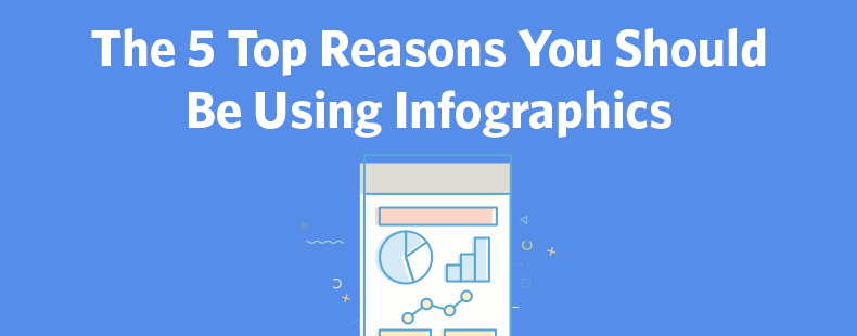
IYou’ve likely seen them: bold visuals, stacked icons, concise text, telling a story at a glance. That’s an “infographic “—but in 2025, it’s more than just a pretty picture. For small-to-medium-sized businesses ready to stand out in a noisy marketplace, infographics remain a potent tool—if used strategically.

How Email Marketing Works - 2025

In the realm of digital marketing, content is king. But to truly reign supreme, you need a trusted steed—email marketing. The combination of high-quality content and strategic email campaigns can propel your small to medium-sized business (SMB) to new heights of engagement and customer loyalty. Here’s a comprehensive guide on how to make this dynamic duo work for you.
Hey there, friend! Have you ever wondered what exactly sets content marketing apart from blogging? Today, let's simplify it in my easy-going style—making it crystal clear and fun for anyone! Here's What We'll Chat About: * What exactly is Content Marketing? * What does Blogging really mean? * What's the main difference between Content Marketing and Blogging? * Why are both super important? * How to blend Content Marketing and Blogging effectively

If you’re running a business in 2025, you’ve probably noticed just how noisy the online world has become. We’re all getting hit with ads, pop-ups, and social media posts every time we pick up our phones. But here’s the thing: **people don’t want more noise. They want a connection. ** And that’s precisely why **email marketing is still one of the most powerful tools you can use to build absolute trust with your audience. ** Whether you’re just starting out or already have a list of subscribers, this guide will walk you through how to use email not just to sell, but to connect — and how * The JR Solutions * can support you every step of the way.
In today’s fast-paced digital world, standing out visually can be the key to capturing your audience's attention.

In today’s fast-paced digital world, attention spans are short, and competition is fierce.

In a world where businesses compete for attention and loyalty, understanding the true essence of a brand is more crucial than ever; this article explores what a brand really is and what it isn’t, helping you navigate the complexities of brand identity in today’s marketplace.

1. Boosts SEO and Online Visibility